Establishing business requirements and goals. Learning about who the user is and what their needs are. Defining meaningful and actionable problem statements that focus on insights and the needs of the user. The insights emerge from a process of stakeholder and user interviews, surveys, competitor analysis, and creating user personas.
Transitioning from identifying problems to creating solutions. Brainstorming to find the widest possible range of ideas from which to select, not simply finding a single, best solution.
An iterative process of generating artifacts intended to answer questions that bring us closer to the final solution. These prototypes can be anything that a user can interact with – a wall of post-it notes, wireframes, paper mockups, or storyboard. Sitemaps, information architecture and high-fidelity static mockups are created for visual representation of the end product.
Testing provides the opportunity to better understand the user through observation and engagement. Trying to find out what worked and what didn't. Refining the solution and informing for the next iteration of protyping and design through usability testing and evaluation, feedback and surveys.

Taking what was learned and giving the design a stuctural markup with scripts and stylesheets to create a finished product with graphical elements.

I am a user-centered, problem-solving, self-motivated UX & UI designer living in Dublin, Ireland. I have experience working in-house, freelance and in an agency environment at every stage of the design process from initial ideation to finished product, creating simple and practical solutions to user's problems.
I love understanding how people think and behave, and leveraging research to design and transform complex tasks into intuitive products and experiences which solve both user and business needs. My ability to learn quickly and my love for new technologies has allowed me to gain experience in a wide variety of fields in the digital world whether it be graphic design, small business websites, eCommerce stores or mobile applications.
When I'm not designing my passion is photography (@dannywatchorn) so I love to travel, hike, snowboard and generally get outdoors as much as I can.
My role: UX/UI Designer
Yooni’s course recommendation software is for Leaving Certificate students who are trying to decide what course to do in college. It combines AI and scientific analysis of a student’s academics, personality and interests to find their best suited college courses in Ireland.
I was approached by the founders of Yooni in June 2020 to help them with the V2 design of their platform. Their original software (built as proof of concept) simply recommended students their top 10 courses based off of their predicted leaving cert points and the exam subjects they sat. These recommendations were generated through a calculator built in to their website and was limited to third level colleges in Cork.
The aim for version 2 was a more robust software service that uses AI and past graduate data to mathematically determine which courses a student has the highest chance of succeeding in academically.

Original results view on Yooni V1.
When I first spoke with the guys at Yooni, both with backgrounds in engineering, they had a clear vision of what the software was going to be able to do and the information they needed to get from their users in order for their algorithm to work. What they needed was someone to put structure to the journey users would take while using the software.
Project Deliverables
What is the expected business outcome for the product?
To make choosing college courses easier for students and help parents save money by having their children select the correct course for them first time.
To improve the overall experience and output of the Yooni software ultimately resulting in more users paying for access to the full feature set.
What are the users' needs?
Users need… an easy way to find college courses that best suit their interests and meet their academic abaility.
Users need… insight in to how and why they are better suited to certain courses.
Users need… more information on job prospects for courses they are matched with.
The first step was to create a user flow to show the journey from landing on their website to purchase of the course recommendation software.
The main consideration was to bring users on an intuitive journey that would motivate them to pay for the full software by slowly giving them access to more features as they progressed through the journey.
Level 1: All users can access the portal dashboard from the main Yooni website to see what the software offers. The college course search is also free to use for all users at this stage.
Level 2: By registering an account with the service for free, users unlock the points calculator and can begin exploring their CAO options to see if they will have enough points for potential courses.
Level 3: For users who ultimately pay for the full software they unlock all the course matching features, detailed personality analysis and insights into the labour market. Paying customers also have the ability to schedule calls with a guidance councillor.

3 tiered access userflow diagram
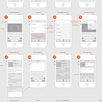
With the basic user flow agreed on it was then time to start mocking up some screens in Figma to provide a visual representation of how users would interact and move through the platform. Beginning with initial sketches there was several iterations of wireframes to get to the final version.

Yooni desktop and mobile Wireframe subset
Using a rough Figma prototype at this stage we were able to show the screens to existing Yooni customers and get some in itial feedback on the new feature set, if the journey actually made sense and uncover any potential issues or pain points users might have.
It was at this point we discovered that users felt there wasn’t enough information on what exactly the benefits of paying for the software were for new users. This was a key learning and the final design was driven with this in mind.
Once we had collated the feedback from testing the next step was to bring the design to a high-fidelity state for both desktop and mobile. This was an iterative process during which I worked closely with the team at Yooni to flesh out the platform design keeping their brand in mind. New screens and components that hadn’t been considered prior to this point also had to be factored in to the design based off the feedback we had received.
Portal dashboard
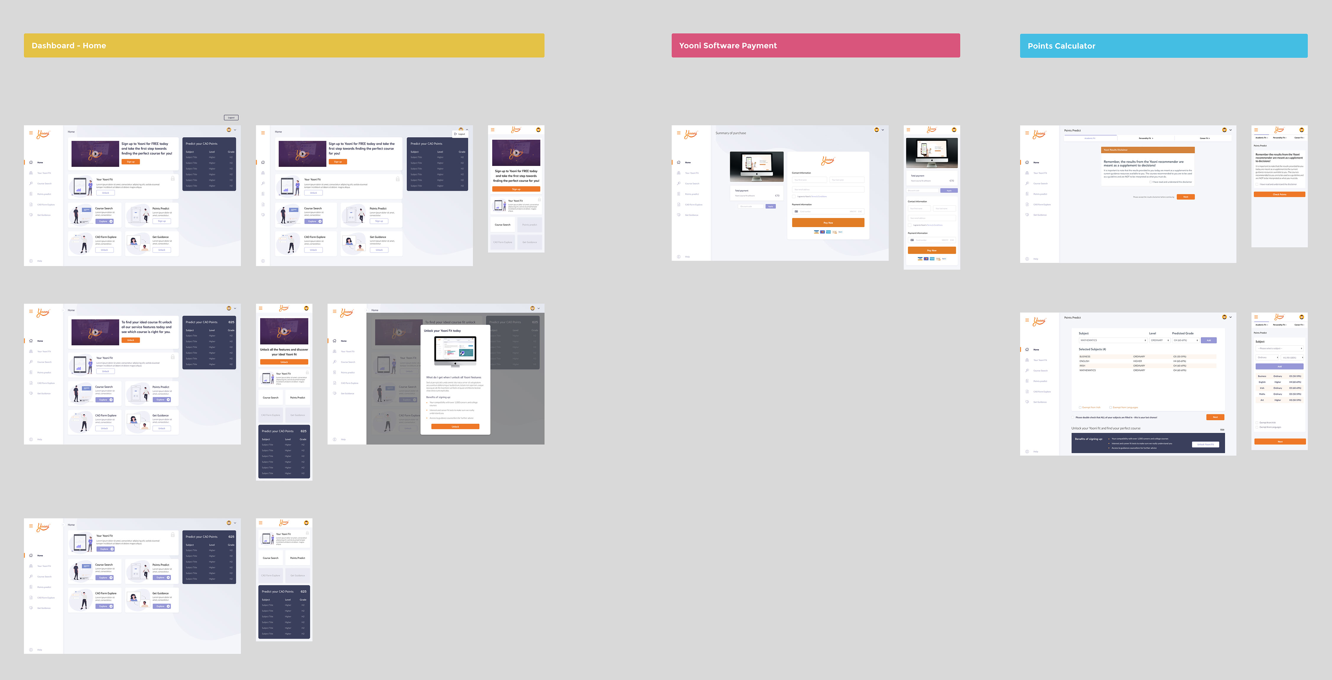
Click image to view larger
Course search hub screens
Click image to view larger
Course match section screens
Click image to view larger
Link to product: Yooni: college course recomendation software.
"Having worked with Danny recently I would confidently recommend him to anyone looking for a UI/UX designer. We gave him the project specs and he delivered above and beyond what we initially expected. One particular aspect of working with Danny that stood out was his ability to take control of the project and voice his opinion to the group when something needed to be altered. Not only skilled in his craft but a pleasure to deal with."
My role: Product Designer
Existing student response systems (eg. Clickers) use multiple-choice selection as input and, as such, are significantly limited in their capabilities. They are not able to provide real-time access to in-depth information regarding where and how the students are making mistakes. This is a major issue in STEM disciplines where the focus is on problem solving.
The UniDoodle application provides a freeform sketch-based input mechanism so that students can now input diagrams, equations, annotations, anything that can be captured graphically! Responses are collected and presented teacher/lecturer in real-time in a gallery-style format for ease of viewing.
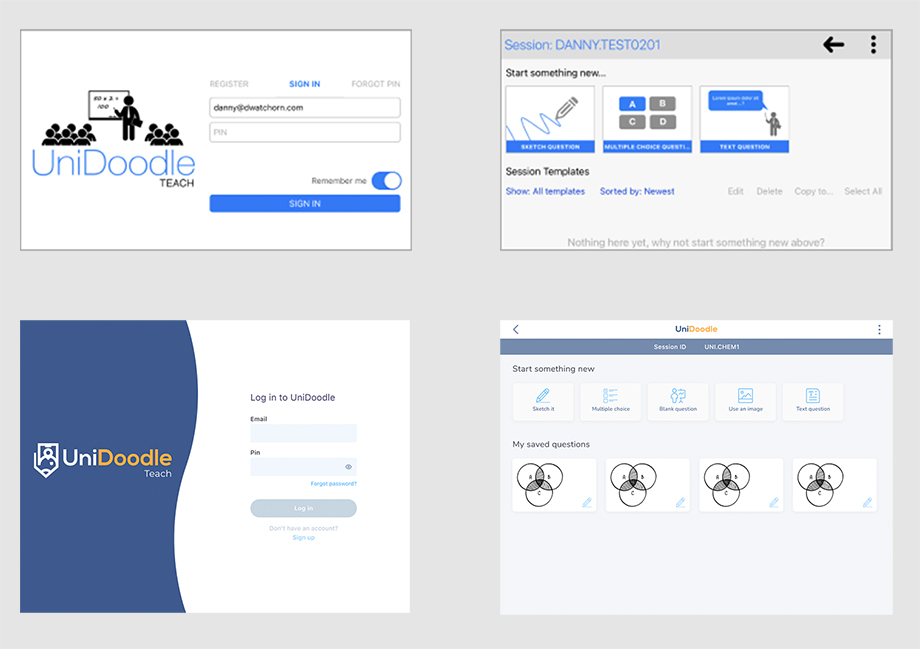
UniDoodle before and after
Part of UniDoodle’s appeal to users is its simplicity. My role in the project was to support the team mobile software developer in achieving a number key goals required to secure their next round of funding. The emphasis was on ensuring that the next iteration remained easy to navigate, intuitive and user friendly.
Project Deliverables
By expanding UniDoodle into a framework application that supports a number of different market verticals and integrates data analytics into the question/answer feedback loop the aim was that this project’s output will create a commercial-ready demonstrator capable of being productised by a new Maynooth University start-up.
Two key goals for the project were:
Feedback from current users have unanimously highlighted and appreciated the simplicity and ease of use of the existing UniDoodle prototype. A key aim in developing the new UniDoodle demonstrator is to ensure this ease of use was maintained, while integrating all the new features into intuitive and interactive user interfaces (both for students and teachers).
For the scope of the project, we agreed on 5 stages:
The first step was to map ot the current user journeys for both the student and teacher sides of the application. The aim of this was to get an objective view of the system architecture and to understand why certain decisions had been made in the current design and how or where it could be improved.
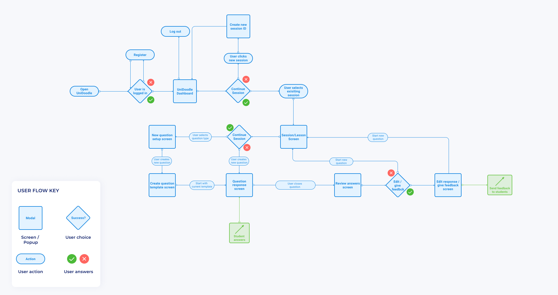
UniDoodle User Flow diagram prior to update
Next I wanted to speak to current users who were already using the UniDoodle app in its beta state in classrooms and also to teachers who had not seen the app before to figure out current frustrations, if the current journeys and navigations made sense to new users and any other opportunities for where users felt the app could be improved.

Remote usability testing
To better understand the market and how similar existing products worked I first carried out a round of competitor analysis comparing the top student response and participation apps. The aim was to learn what the competitors were doing well and where the UniDoodle App could improve on what was already available.
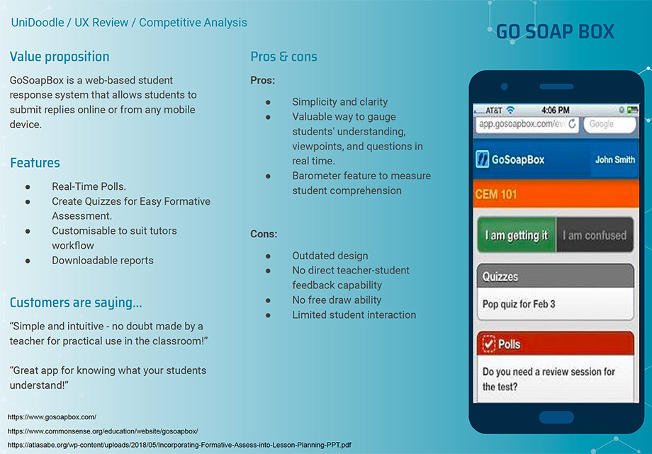
Go Soap Box
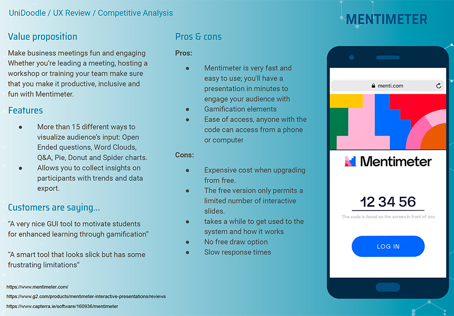
Mentimeter
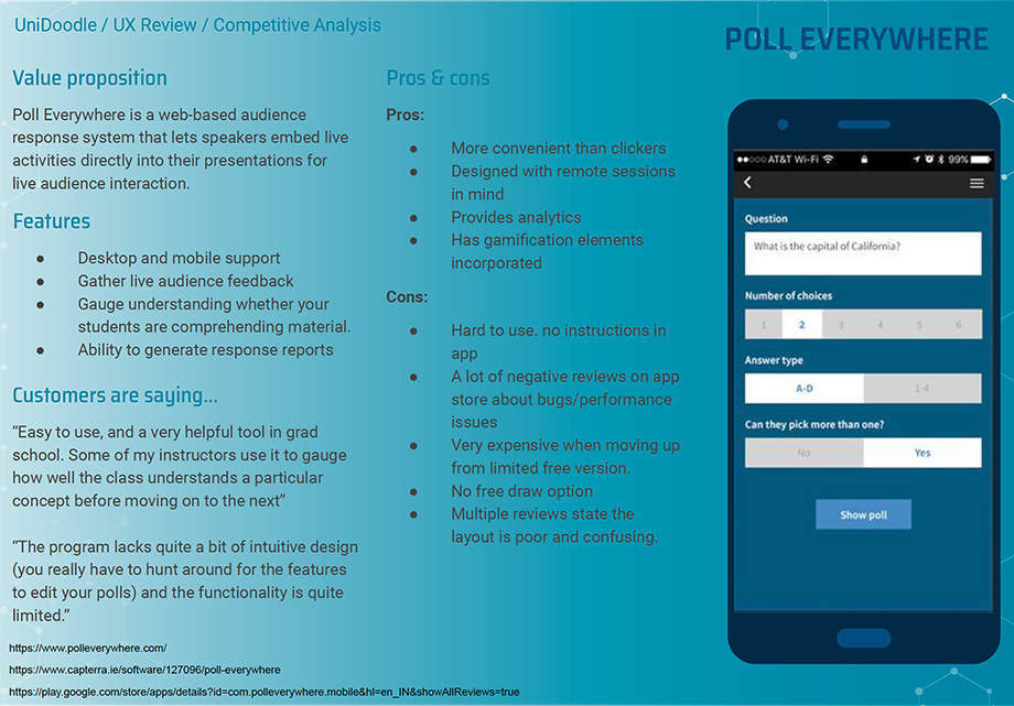
Poll Anywhere
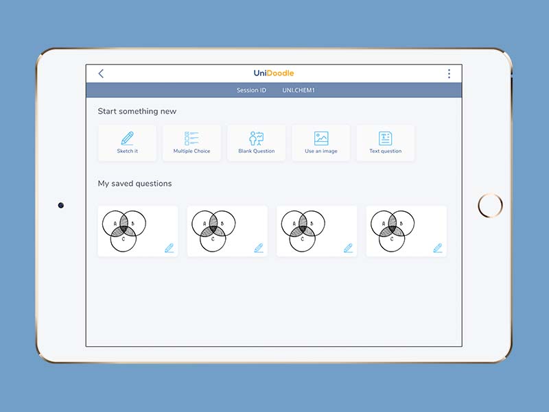
Taking what we learned from the research and testing a new set of features and enahncements were agreed on by the project team. The firat part of the design process focused on functionality and space. Wireframes were used to see how the new features would look and fit withing the app UI.

UniDoodle wireframes
UniDoodle is a multi-platform mobile application so the redesign had to cater for both tablet and smartphone size screens taking into consideration the changes in display when moving from portrait to landscape and the limitations this may create. Decisions were made as the project progressed to limit certain views to only portrait on smaller devices due to the lack of scree real estate when switched to landscape.
The app is also available on both Android and iOS so an effort was made to factor the dfferences in their speciifc design guidelunes io the redesign where applicable.

Click image for larger view

Click image for larger view
Link to website for updates: UniDoodle Teach
My role: UX Research, UX Design, UI Design
Irish Life’s main conversion metric for their websites is lead generation, users that schedule calls with Irish Life Financial Advisors. Over the course of 2020 a new initiative was launched called the ‘My life Planner’ with the aim of boosting incoming leads to the financial advice team.
The ambition for this project was to find a way to engage with younger customers and potential customers who are generally less likely to deal with Irish Life or speak to a financial advisor while also not isolating any other segments of the customer base
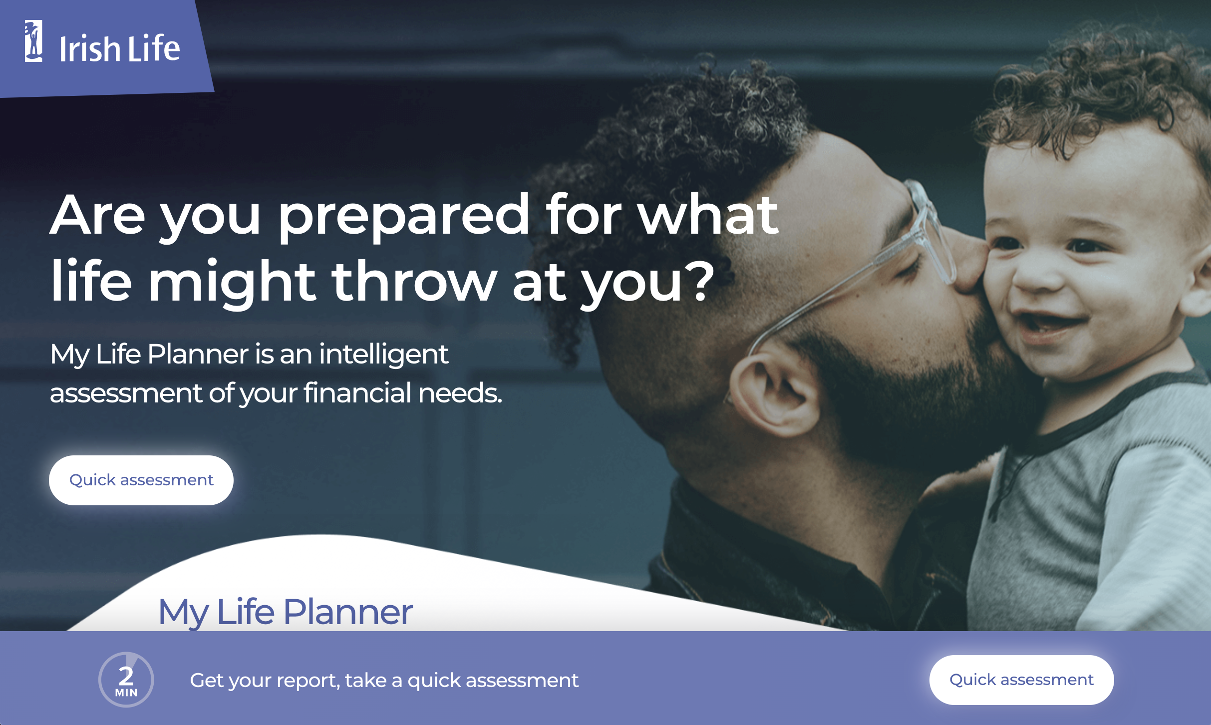
MyLife Planner landing page
The design team was tasked with creating a new digital experience that was both more engaging than the typical Irish Life online calculators that are available across the main Irish life websites and also provided enough value to customers to get them to schedule a call with the business.
Project Deliverables
What is the expected business outcome for the product?
Goal 1: To get more more people interacting and engaging with the business across the three different business divisions (Irish Life Health, Retail and Corporate Business).
Goal 2: To generate more leads coming in to the financial advice team and ultimately drive more sales. A strong focus however was placed on the younger cohorts who are seen to be less likely to interact with Irish Life in general.
In order to understand who we were designing this new experience for we wanted to look at the Irish Life customer base as a whole and get to know our customers better. To begin this process a number of internal interviews were carried out with members of the customer support and financial adivce team as well as with various subject matter experts from the different business divisions who could speak about their particular customer base and what usually motivates them to engage with the business.
The feedback we continually received was that customers regularly lacked confidence to speak with a financial advisor. They didn’t feel they understood financial products well enough and were often reluctant to speak to the business as they felt products would simply be pushed on them due to their level of understanding without knowing if it was something they actually needed or not.
Users need… to better understand their current financial situation relative to their peers.
Users need… more information on what Irish Life products are available to them and how they will benefit them at their current life stage.
Users need… to feel more confident and prepared to discuss financial and health products with an advisor.
With this in mind we wanted to create an experience that firstly helped us (irish Life) to get to know our customers better in an informal way and in turn empower them to better understand their financial situation and what products were available to them that they could potentially benefit from.
The hope was by providing this value to users for free they would then feel confident enough to speak with a member of the Irish Life Financial Advice team who could go into more detail with them over a call.
Approach
Criteria:
A similar busines model to Irish Life in that Discovery has multiple divisions that operate as separate businesses under the one umbrella. They incentivise having more than one product by using their Vitality loyalty programme which underpins all their cohorts. Vitality rewards good behaviour and engagement across all products. The more products you have, the better the rewards.
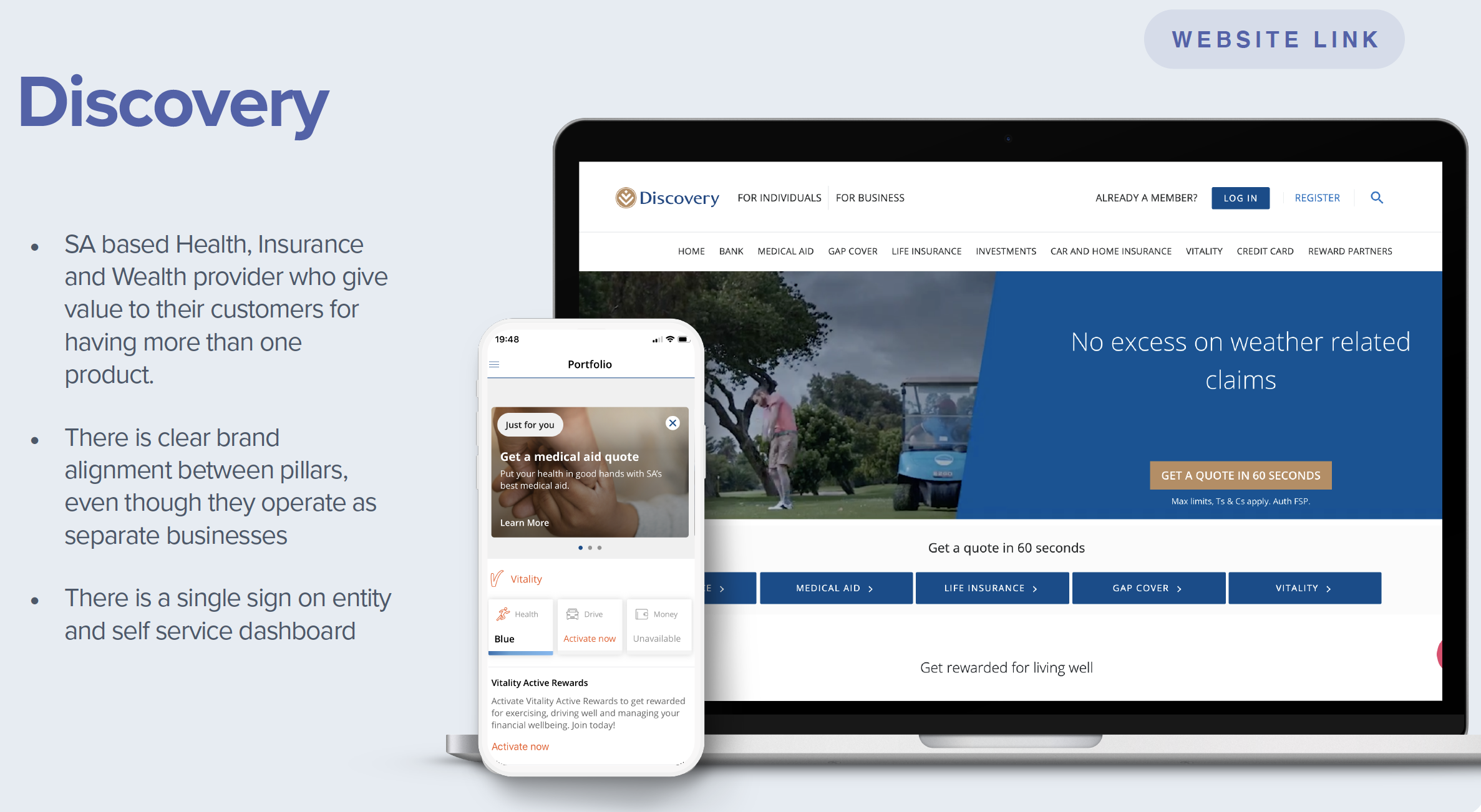
Discovery Insurance
Adobe created a fun and interactive campaign site, which get’s users to find out what kind of creative they are. The survey asks 15 questions, limiting the answers to two options. After each question you are shown a video depicting the answer you chose. Your creative type is a quirky character which is insightful and sharable.
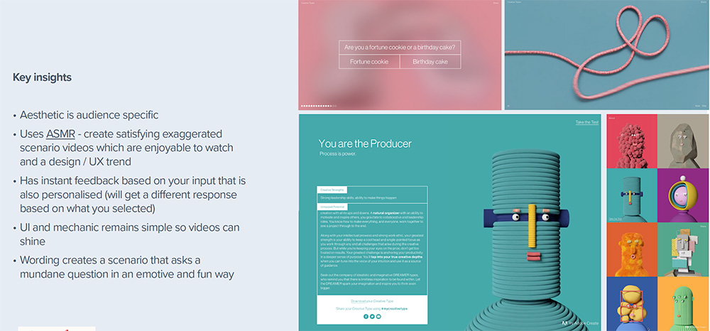
Adobe Creative Type
Website educates you on sustainability and the impact of your decisions around your stuff, the way you use water, food and electricity consumption. Website is fun and educational and creates a dashboard view of what you do/don’t do and pledge do better

Adobe Creative Type

Udacity
After an exhaustive market research process we moved on to an internal 'as is' review of the Irish life ecosystem looking at all of the current brands websites and product suites
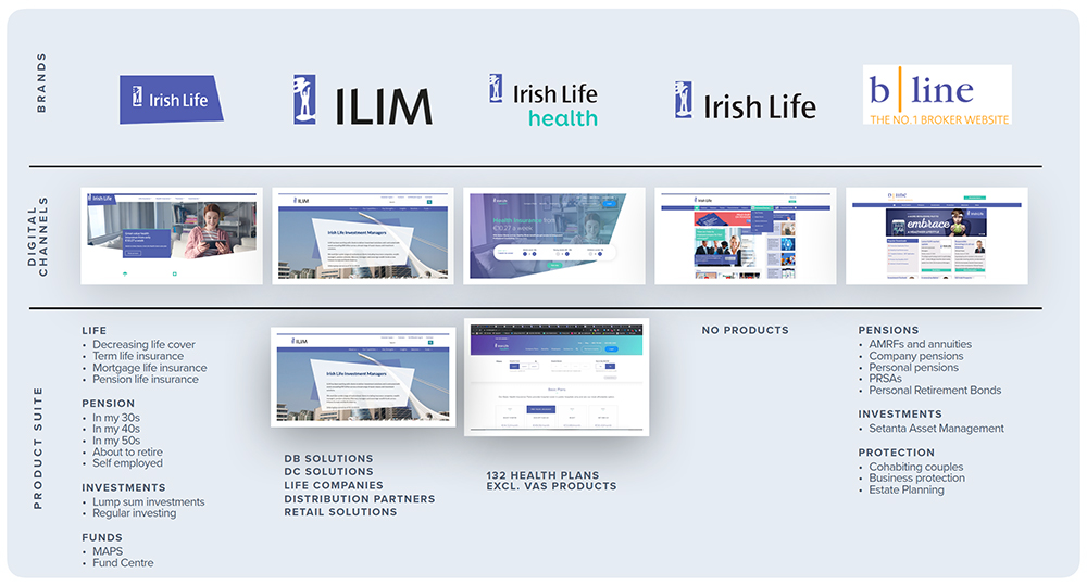
Irish Life digital ecosystem

Life Score Initiative
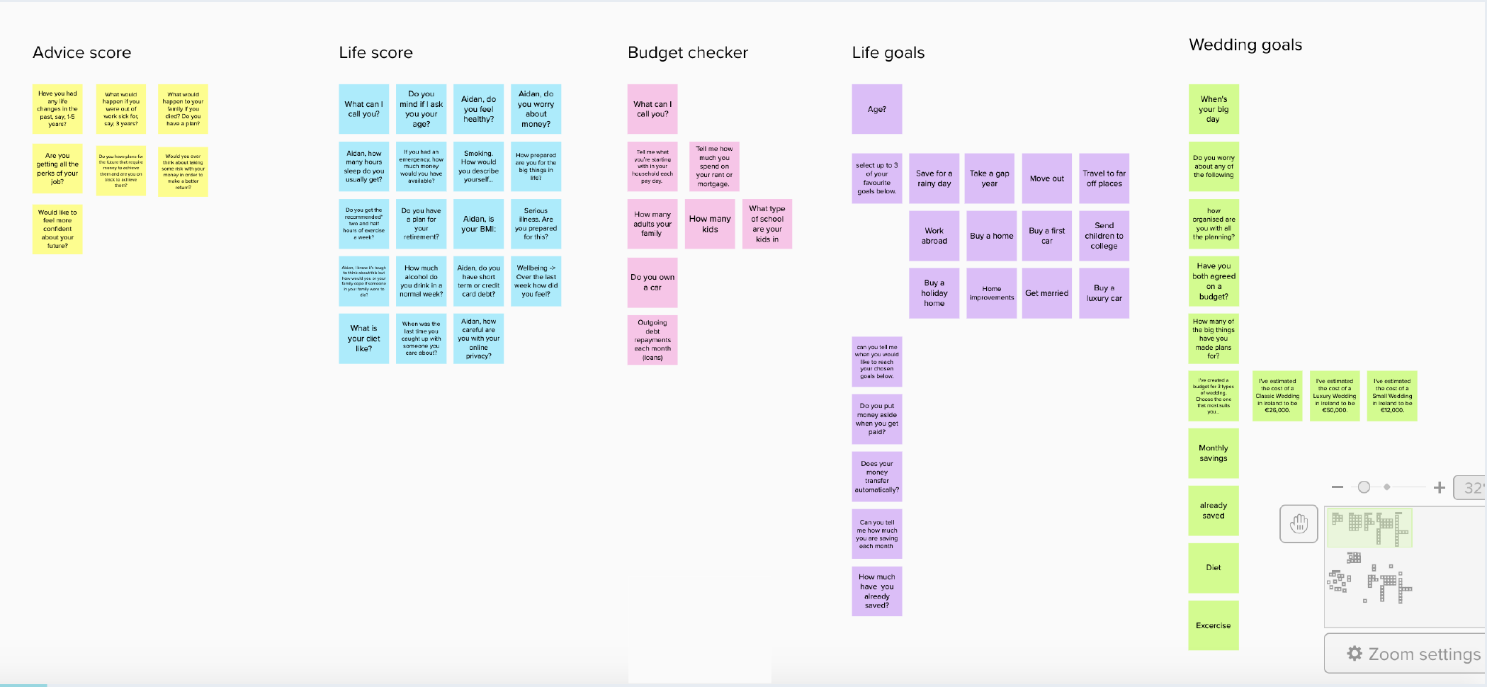
Profiling Affinity Diagram
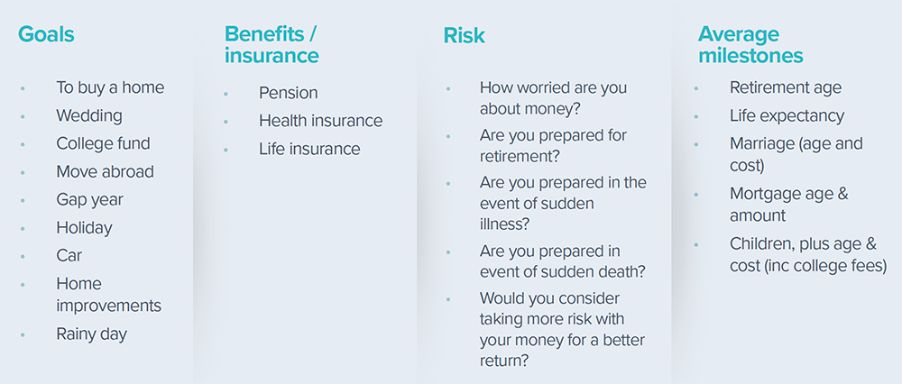
Having reviewed all of the various websites, digital products, questionnaires and calculators used throughout the organisation we then started to look at patterns of questions and customer data that get regularly gets asked for to better understand how profiling was currently carried out and for what reasons customers interact with Irish Life
e.g. what are their goals and motivations, what does their current financial and home life look like. This information was then distilled into 4 customer segment types that we would use to build this tool around in abscence of proper user personas.
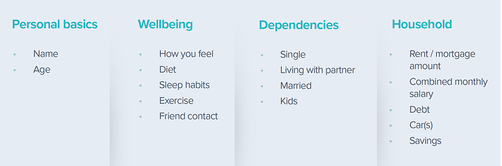
Customer profiling questions
Customer motivations
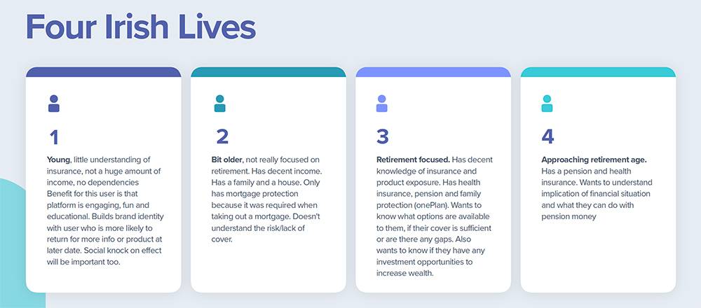
Customer segment types
Taking what we had learned from our research our first task was to create a ‘North Star’ vision piece that was used to communicate with the wider business stakeholders and get buy in from the various parts of the Irish Life organisation. The hope was for this tool to accommodate each of 3 main business divisions which had never been done in Irish Life up to this point. The ‘North Star’ by nature was aspirational to show 'the art of what's possible'.
Our hope was to create a robust profiling tool that builds a true profile of who the customer is, as a multifaceted and ever-changing person, from their physical fitness through to their family status and financial wellness.
With this information we could use then gap analysis to tailor product recommendations and provide useful needs-based information at a glance to customers at various stages of life. Something Irish Life customers could come back to and update as their life situations changed so we could continue to offer them the ‘next best action' and anticpate their needs now and into the future.
My role in creating the North Star concept was as both UX and UI designer. Helping to shape the user journeys and work on the UI along with a external agency we hired to help us specifically with the UI aspects of the project and building out the various components used throughout that main dahsboard.
Click image to view North Star design file
After the vision piece had been shared witht he business stakeholders we faced a number of challenges from the various business divisions as well as compliance on what we could actually deliver due to the structure of the organisation:
Main business concerns:
To address the challenges as best we could we created a stripped-down MVP version of the product that allowed us to keep some of the core functionality from the ‘North Star’ concept and still provide some value tbut in a much more limited fashion that would allow us to release at speed.
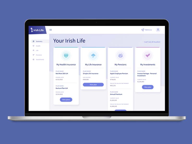
The MVP solution we created was a short 'needs assessment' quiz using the same card sort interface used in the North Star concept to create a high level profile of a user. We also included a much more basic version of profile dashbaord to populate that once completed would allow users togenerate a report outlining their current level of cover and the areas that had room for improvement.
The report is generated using a matrix that is populated using the user’s answers triggering one of a number of possible reports. Users then had the ability to schedule a call with an Irish Life Financial Advisor off the back of this selecting which areas of interest they wanted to discuss in advance (Health Insurance, Life Insurance, Pensions, Investments).
Click image for MVP design file
The first round of testing was carried out on this new stripped-down version of the product after it was given the green light by stakeholders and compliance. Each round usability testing with between 6 – 8 existing Irish Life customers across the various demographics.
Results of each round of testing were collated using Mural by myself and the two other designers on the team before being condensed into a deck for presenting back to stakeholders to explain what our customers were telling us about the current experience and where there was opportunities to improve in terms of both the data capture process and the information in the report.
After a number of rounds of testing it was determined that quite a number of the questions we were originally asking had little to no effect on the answer matrix or the outcome of the reports that were being generated. The users we tested with had already told us that for the amount of value they got out of the report they would like the questionnaire to be quicker so we were able to whittle down to between 10 – 12 questions and bypass the profile dashboard view to go straight to the report.
We were also able to make incremental changes to optimise the report content with the help of our copywriter to provide more insightful information that users actually wanted to know based off the feedback they had given us, this included: Tips for products they might want to look into, the benefits of speaking to a financial advisor about their current situation, questions they might want to ask on a call so they can feel more confident and better prepared to speak to an advisor.

Current MLP experience
Since its launch in October of 2020 the My Life Planner app has gone on to become the third highest lead generating tool across the organisation.
My role: UX/UI Designer
Yooni’s course recommendation software is for Leaving Certificate students who are trying to decide what course to do in college. It combines AI and scientific analysis of a student’s academics, personality and interests to find their best suited college courses in Ireland.
I was approached by the founders of Yooni in June 2020 to help them with the V2 design of their platform. Their original software (built as proof of concept) simply recommended students their top 10 courses based off of their predicted leaving cert points and the exam subjects they sat. These recommendations were generated through a calculator built in to their website and was limited to third level colleges in Cork.
The aim for version 2 was a more robust software service that uses AI and past graduate data to mathematically determine which courses a student has the highest chance of succeeding in academically.
Original results view on Yooni V1.
When I first spoke with the guys at Yooni, both with backgrounds in engineering, they had a clear vision of what the software was going to be able to do and the information they needed to get from their users in order for their algorithm to work. What they needed was someone to put structure to the journey users would take while using the software.
Project Deliverables
What is the expected business outcome for the product?
To make choosing college courses easier for students and help parents save money by having their children select the correct course for them first time.
To improve the overall experience and output of the Yooni software ultimately resulting in more users paying for access to the full feature set.
What are the users' needs?
Users need… an easy way to find college courses that best suit their interests and meet their academic abaility.
Users need… insight in to how and why they are better suited to certain courses.
Users need… more information on job prospects for courses they are matched with.
The first step was to create a system flow diagram to show the journey from a user landing on their website to purchase of the course recommendation software.
The main consideration was to bring users on an intuitive journey that would motivate them to pay for the full software by slowly giving them access to more features as they progressed through the journey.
Level 1: All users can access the portal dashboard from the main Yooni website to see what the software offers. The college course search is also free to use for all users at this stage.
Level 2: By registering an account with the service for free, users unlock the points calculator and can begin exploring their CAO options to see if they will have enough points for potential courses.
Level 3: For users who ultimately pay for the full software they unlock all the course matching features, detailed personality analysis and insights into the labour market. Paying customers also have the ability to schedule calls with a guidance councillor.
3 tiered access userflow diagram
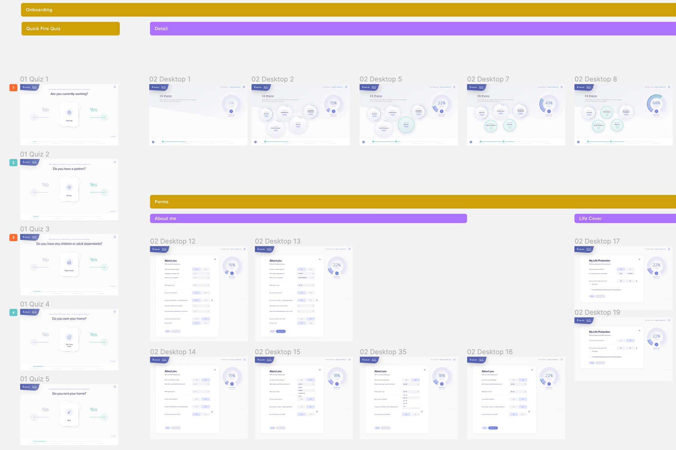
With the basic user flow agreed on it was then time to start mocking up some screens in Figma to provide a visual representation of how users would interact and move through the platform. Beginning with initial sketches there was several iterations of wireframes to get to the final version.
Yooni desktop and mobile Wireframe subset
Using a rough Figma prototype at this stage we were able to show the screens to existing Yooni customers and get some in itial feedback on the new feature set, if the journey actually made sense and uncover any potential issues or pain points users might have.
It was at this point we discovered that users felt there wasn’t enough information on what exactly the benefits of paying for the software were for new users. This was a key learning and the final design was driven with this in mind.
Once we had collated the feedback from testing the next step was to bring the design to a high-fidelity state for both desktop and mobile. This was an iterative process during which I worked closely with the team at Yooni to flesh out the platform design keeping their brand in mind. New screens and components that hadn’t been considered prior to this point also had to be factored in to the design based off the feedback we had received.
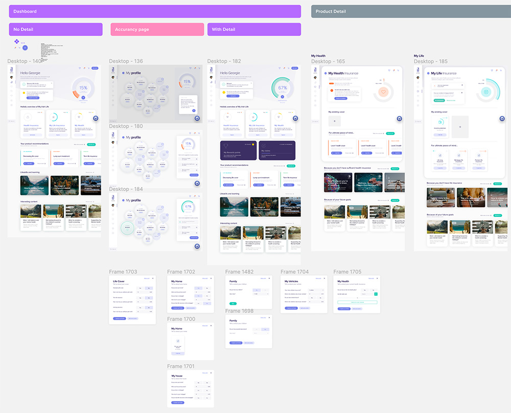
Portal dashboard
Click image to view larger
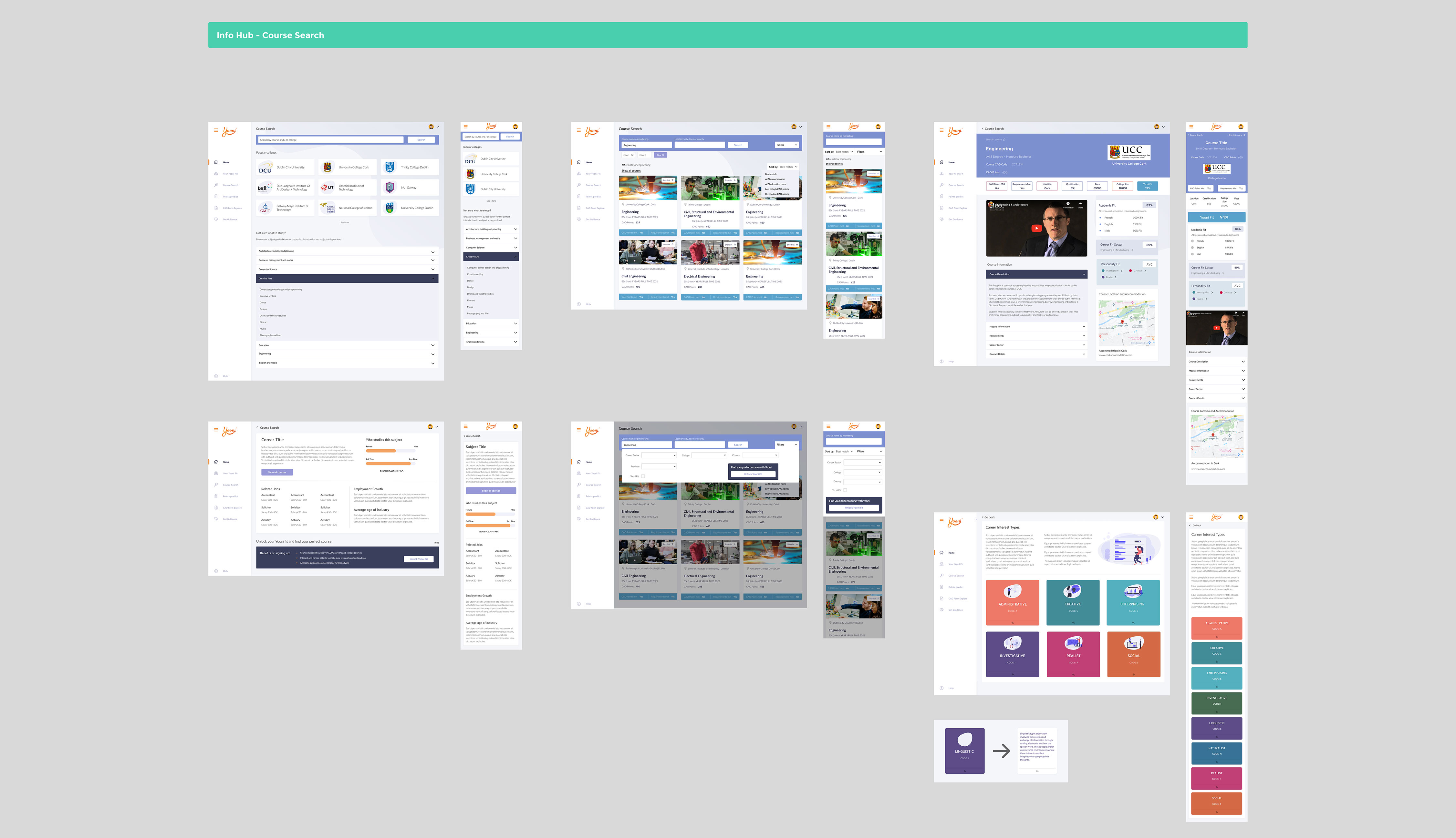
Course search hub screens
Click image to view larger
Course match section screens
Click image to view larger
In its first year of activity (2020/2021) the Yooni platform has:
"Having worked with Danny recently I would confidently recommend him to anyone looking for a UI/UX designer. We gave him the project specs and he delivered above and beyond what we initially expected. One particular aspect of working with Danny that stood out was his ability to take control of the project and voice his opinion to the group when something needed to be altered. Not only skilled in his craft but a pleasure to deal with."
My role: Product Designer
After an internal audit of the CabForce product (The ground transportation element of CarTrawler) a number of key findings around drop-outs at each step in the conversion funnel were discovered.
The main area that was found to have room for improvement was step 2 (Search results) with the largest (relative) drop–out in the entire funnel with Only 22% of users converting from step 2 onto the next step.
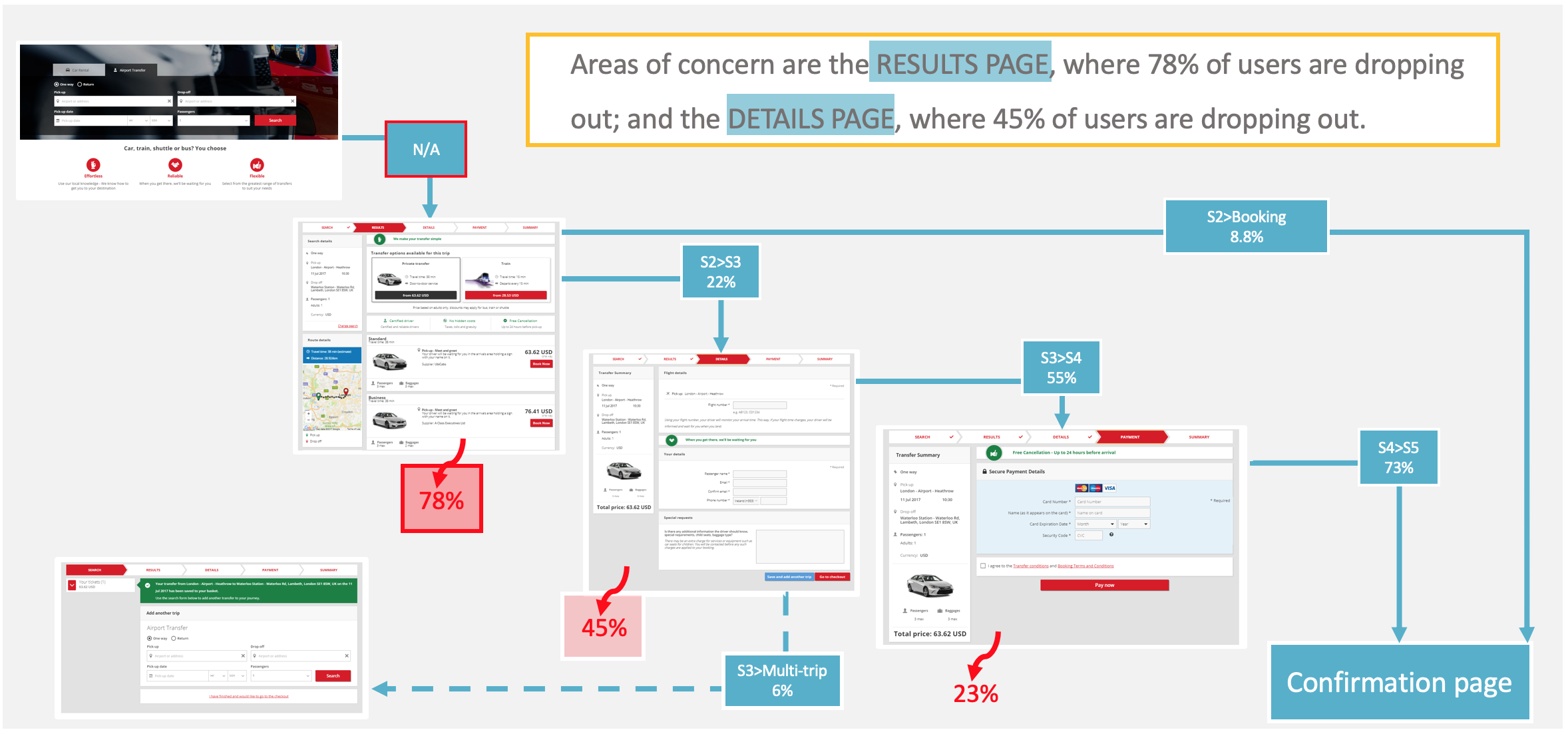
Conversion funnell drop-out breakdown.
A segment of users are struggling to correctly specify their search on step 2 and are dropping out of the funnel. Using key business and user needs, identify opportunities for improvements in the search results page and provide design solutions to enable users to carry out more informed searches.
Project Deliverables
What is the expected business outcome for the product?
To improve product clarity at step 2 in the funnel and better promote the key company USPs with the aim of increasing conversion (confirmed customer bookings).
What are the users' needs?
Users need… more clarity around the product overall (CabForce name is somewhat misleading). More information around what the product is and isn’t.
Users need… to see important information about their pickup (meet & greet) so they can feel more reassured.
Users need… more clarity around what each product is i.e. private/shuttle.
Users need… to clearly understand the difference between service levels (standard/premium/luxury).
A number of design thinking workshops were carried out with stakeholders from different departments in the business to put some shape around the key business and user needs before moving on to the design phase.
The first of these was a “How Might We” workshop to reframe each user need in to a “how might we…” question that we could then look to action and try to solve for.
i.e. How might we… let users know that premium bookings offer X over standard?

Stake holders in teams going through a round of “find 3 things in common” to get people talking openly with each other before moving on to reframing the user needs in to actionable “how might we” tasks
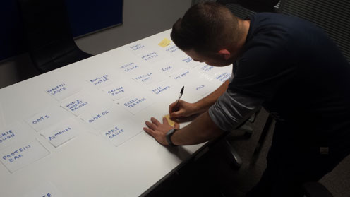
From this workshop a number of ideas around main pain points and what could be done to improve them were outlined, all while still keeping in mind the business and user needs. The next task was to organise these wants and pain points in to actionable groups that could be looked at improving from a design perspective. To do this I ran another workshop with the design team at CarTrawler to collaboratively organise the feedback in to groups that made most sense and assigning a weighted number to each group in order to give priority when it came time to design.
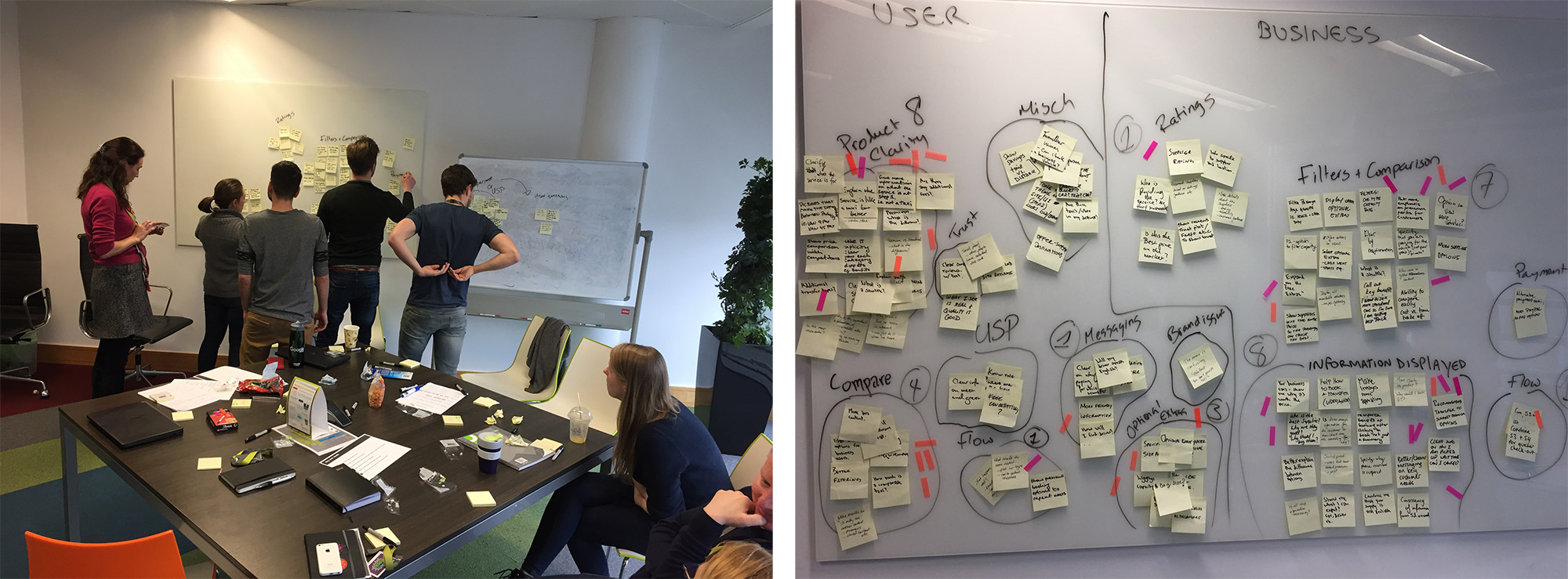
Design team categorizing how might we notes in to actionable groups
Workshop Output

In order to make sure that what we were doing was an improvement on what was already being offered by the competitors a round of competitor analysis was carried out with a focus on each individual grouping that was being looked at:
Companies researched: Hoppa.com, Rideways, Holiday Transfers, Sun Transfers, Jayride and Mozio
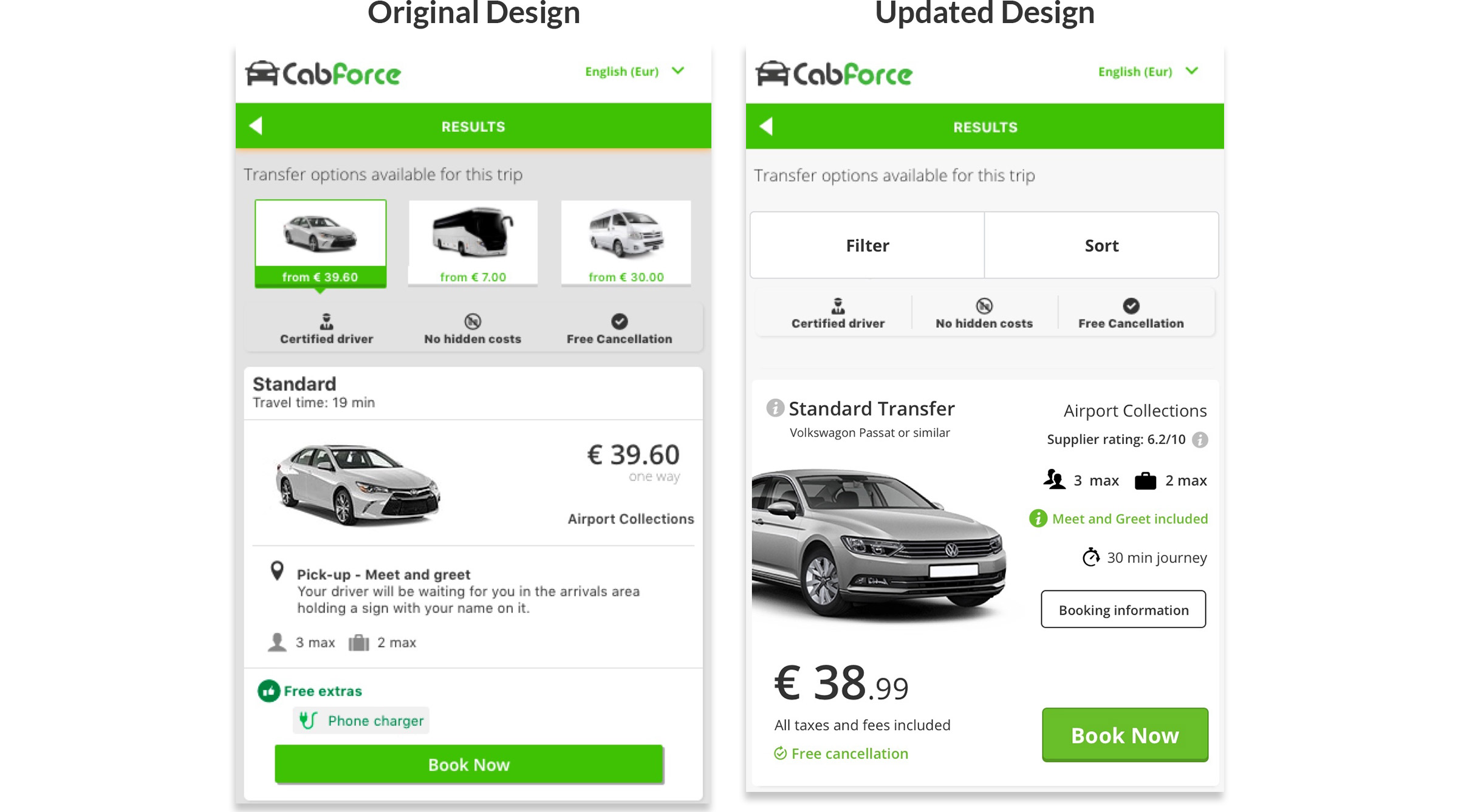
As this project involved updating rather than completely redesigning it was decided that there was no need to go through a wireframing stage. Instead we focused firstly on updating an individual card for each of the service types (private, Shuttle, Train. Bus) across the different viewports and then looked at improving the secondary information provided on the results screen (i.e booking details, filters, USPs etc)
Original Search Result card
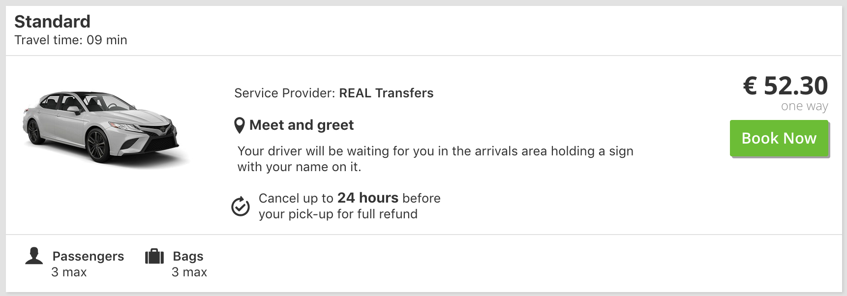
Updated Search Result card
The card design was updated based off feedback from the worksops carried out, main points were to use larger, more striking images, to provide more clarification on the level of service offered, to provide better grouping of vehicle and company information in to blocks that made logical sense, introducing tooltips to allow for further more detailed provider specific information and making the pricing more prominent on the card.


Mobile Card Design
Desktop Designs

Click image to view larger
Mobile Designs (including updated filters)

Click image to view larger
My role: Product Designer
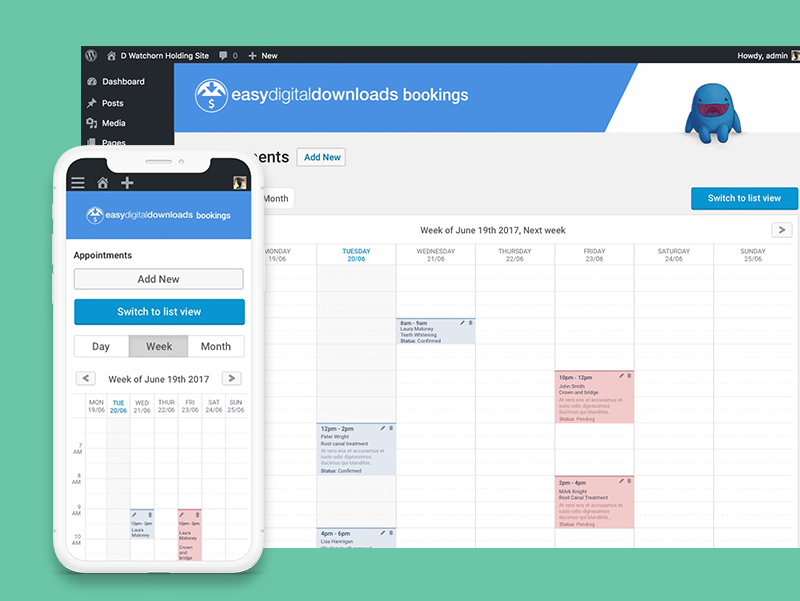
EDD Bookings is a plugin extension for Eazy Digital Downloads created by Malta based development company Rebel Code. The project to update the booking engine came about as they realized that their existing engine was quite limited and as a result was not meeting the needs of their wider target audience.
When it comes to setting up bookable services online a ‘one size fits all’ tool definitely does not work so the idea was to create a fully customisable booking engine that could be used to setup and offer almost any bookable service allowing user to assign resources, staff, locations, and setup variable pricing.
"A simple appointment booking solution Integrated with the powerful & reliable EDD e-commerce plugins for WordPress. Here to help a variety of service providers"
What is the expected business outcome for the product?
To grow the user base by offering a more robust and customisable tool than is currently available using the existing product and also on offer by the business competitors.
What are the users' goals?
To have a quick and easy way to set up and manage bookable services regardless of type for their businesses.
While there was already some idea of the new functionality required a competitor analysis was carried out to get a better idea of how other booking engines set up and managed bookings from both an admin and customer perspective to gain inspiration for the design and to see where we could make improvements on the current offerings in the market space.
As there was already an existing product in place I wasn't required to go in to great detail creating user flows and personas as the project brief was simply to expand and build upon what was already there and offered by the business competitors. With that brief I set about creating a baisc wirframe design for the product using the exisitng plugin as the basis and building out the new features as described in the project docs provided by Rebel Code and from collaboration with the CEO

Early stage concept wireframes
Using Axure a basic prototype was built to demo the user journey and see how intuitive each screen felt when shown to external parties outside of the project.
Once the new proposed functionality had been fleshed out and concept validated the wirframes were taken through to hi-fi design for both desktop and mobile, this was a iterative process that took the design in new and unexpected directions (espically around the calendar and availabilty settings for admins) once we began to see to whole journey mapped out.
To get some proper feedback on the new features and functionality the designs were moved in to Invision to prototype for user testing before build. Link to prototype below.


Link to product: EDD Bookings Plugin
"Danny joined us at a time when our new appointment bookings solution was taking shape, but we had spent far too much time trying to figure out the UI and UX ourselves. Danny was given the low-down on what we wanted to achieve and he managed to convert a complex idea into a simple solution through an interactive calendar. Within a few weeks we were able to get to work on the new UI and continue to evolve the idea as we gathered feedback. It was also great to have him available for Skype calls and discussions to ensure we remained on the same page."
My role: Interaction Designer | Information Architect
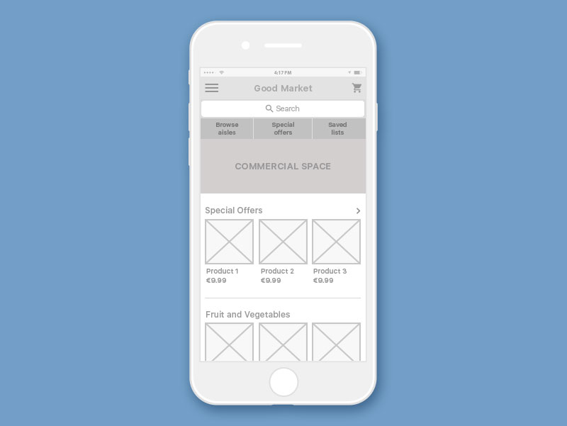
GoodMarket is a small grocery franchise based in the United States. Although their customer satisfaction ratings have remained relatively constant over the last 4 years, their market share has been decreasing by 8% each year. If they continue at this rate for another year or two, they’ll be forced to shut their doors. Through some market and user research they have determined that this decline is most likely due to the increase in online grocery ordering & delivery products.
Many customers prefer these products to shopping in store because they’re faster, easier and more convenient - customers can shop from their desks, homes, or in line at the coffee shop. GoodMarket believes that if they allow their customers to shop and buy their products online, they can expand their customer base and market share.
Good Market has put together the following vision for their new online product:
"GoodMarket is a grocery shopping tool that helps customers quickly and easily shop and purchase groceries online, and then have them delivered promptly at little to no cost."
In order to figure out which customers to target with their product, GoodMarket did some user research. After observing customers in their stores, and talking with users of a competitor's product, Good Market has determined that busy young professionals make up a large portion of their product’s target market. They’ve create a persona called “The busy professional (TBP)” to describe the qualities of the type of user they’re focusing on.
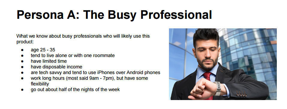
User persona for GoodMarket's mobile app target audience.
What is the expected business outcome for the product?
Expend customers base and market share, deliver products to other cities around the country. Being competitive on the grocery market and in online ordering & delivery products in particular.
What are the users' goals?
Quickly and easily shop without spending extra time on it (purchase online), get fresh groceries delivered promptly.
To get a better understanding of how users shop online currently a competitor analysis was undertaken to how other companies offering the same/similar services had gone about things and to see where there was opportunities to improve on the overall experience.
Scenario of use to describe the typical experience that a customer like The Busy Professional (TBP) would have when ordering their groceries online:
It is late in the afternoon and Tom is in his office. He has just found out that he has a late meeting he needs to attend and won’t get a chance to go shopping after work as he had planned.
He has heard through a colleague that one of the local stores now has an online shop and also provides delivery service too. Knowing he is running low on food at home he decides to give it a try. While walking to the canteen to get something to eat before the meeting Tom takes out his phone and goes onto the GoodMarket website to check it out. He finds that he can actually really quickly get most of the essentials he needs on the GoodMarket online shop and that prices are reasonable too. He is even more impressed when he sees they offer late deliveries and he places his order and selects to have his order delivered to his apartment for 8pm, by which time he should be home.
What is the context of use? In what settings will the product be used?
- For what length of time?
It should not take the user more than 15 - 20 minutes to do their shopping online. greatly reducing the time and effort spent travelling to and from the grocery store and actually doing the shopping in person.
- Will the user likely be interrupted or otherwise need to return to tasks?
First time users may be interrupted in order to setup a new account with personal information (name address) and also to provide billing information. This information should be savable though if wanted by the user to provide repeat users with a much quicker 1 click checkout option on return visits.
- Should GoodMarket exist first as a mobile or web-based product?
Using the persona to steer direction, mobile first would seem to be the best option as it will allow the user to shop anytime anywhere directly from their phone.
- Are there multiple users of a single account or device?
No. 1 user account with name and address and payment details setup is all it will require to use the product to do your grocery shopping and have it delivered to your home address.
The next step was to to run a a usability analysis review of a similar product to get an even better idea of what works and what doesn't and how the GoodMarket could be designed to improve on the existing options already available. This analysis was done using usability heuristics to review one of the larger online grocery apps in the areas of learnability, efficiency, memorability and error handling.
This exercise was carried to try and best categorise the GoodMarket inventory for search on mobile. It was important to organise the store's products in a way that would make sense for the user to find them. To help with this I ran a a mix of in person open card sorting workshops and also ran a closed sort using the online tool OptimalSort to help determine users’ conceptual models of different categories of items on the app.
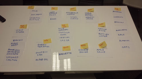
Open card sort workshop.

Results from closed card sort on OptimalSort.
From the information gained using the card sort I then created a preliminary sitemap for the new application taking into consideration all features and pages that would be needed outside of and along with the actual store categories.

GoodMarket sitemap.
The next step was to create a user flow to show the journey to purchase from opening the app using the new sitemap as the template for each step in the process. This was especially important as the user needs to sign in before they can checkout and as such there needed to be a prompt to sign in at some point in the journey.
Click image to view larger

GoodMarket userflow for journey to purchase.
With the basic user flow now laid out it was time to mock up some screens to provide a visual representation of how users would interact with the app to move between the screens while they went through the process of browsing, choosing and ordering their groceries. There was several iterations of the wireframes beginning with some rough sketches to get to the final version below.

Mobile wireframes for the GoodMarket application.
A diagram put together to show the different screens in sequence throughout the user journey in preparation for the prototype.
Click image to view larger

GoodMarket wireframed user flow diagram.
Using InVision I have put together a working prototype for the GoodMarket app in order to try and gain validation in it's functionality.
Currently using the prototype to collect feedback on the functionality of the app, the likelihood being that there will need to be some changes made before moving on to the UI design for the app.
My role: UX Researcher
Poor nutrition on the job is resulting in a decrease in productivity and an increase in excess weight and obesity. Because of today’s busy work life, many office workers pay little attention to their eating habits. Many start their days reluctantly rolling out of bed after hitting the snooze button for the last possible time and then rush out the door without even so much as thinking about breakfast. There are others then who are so busy during the day that they skip lunch or if they do eat something its a ready made sandwich and some chocolate for example eaten at their desks.
As a result of skipping meals snacking can become difficult to control, especially as there is always an excuse for treats and sweets in the office space (somebody back from a holiday, a birthday or somebody leaving etc).
To confirm my hypothesis and to try and find a solution to the problem I carried out some user research with the some key goals in mind:
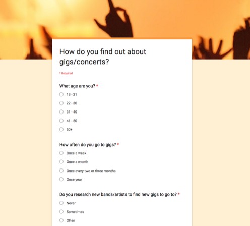
The first step was to send out a screener survey to office workers in order to gain as much information as possible about the lifestyle and eating habits of actual office workers.

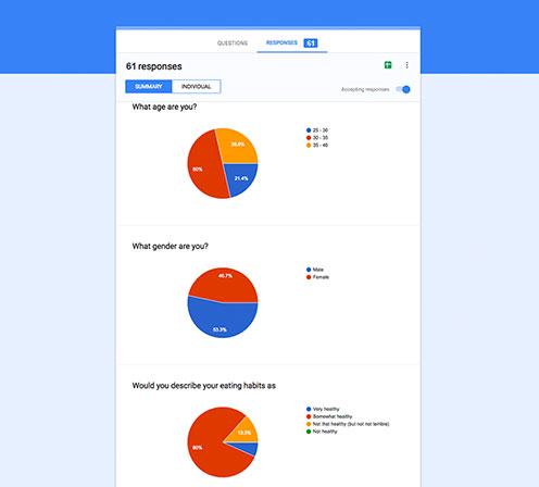
Initial screener survey.
While I was still waiting for the survey feedback I began running a number of user interviews to get a better insight into the typical day to day of different office workers both male and female. It was interesting to see different patterns emerging among the male and female participants. These patterns were later backed up by the data gathered from the user survey.
Key findings:In order to try and gain empathy with and get a better understanding of the users I created an empathy map using the key themes that kept re-occurring during the user interviews and in the survey responses. Organizing the data this way allowed me to ensure the project was user-centered and also to provide a visual reference of the broader influences of the users lives.
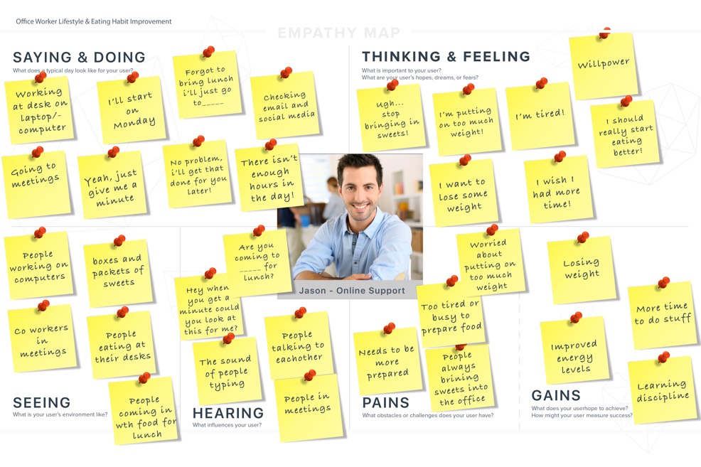
User empathy map.
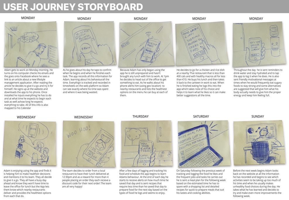
My next step was to to show the users in context to show not just what the users are doing, but where they are when they're doing it all the time keeping the user in mind. Once the storyboard was finished it was then shown to a number of users who participated in the survey or interview stages for validation. Feedback was positive with nearly everyone who it was shown to saying they felt this story was about them personally!
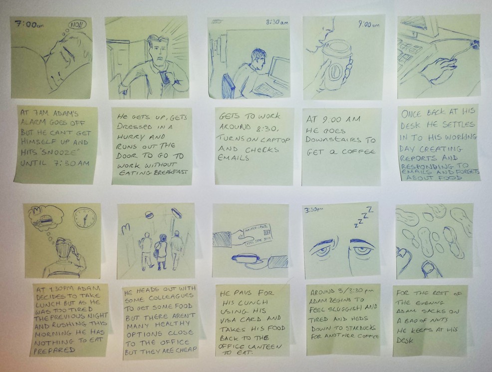
Current state storyboard created during research phase.
At this point I felt I had gathered enough data and organized it so as to create empathy with the user. It was now time to look for insight and create a Point Of View (POV) statement to frame the problem space that best sums up what our users’ need while also helping me to begin looking at ways in how we might solve for them too.
A busy young professional short on time and with little spare money needs to find a way to eat healthier meals throughout the day because he knows his poor diet is not good for his overall health.
How might we help the user to manage their time throughout the day better so they can find extra time to prepare healthier meals.
How might we provide easier access to healthier meals for office workers at convenient times and at more affordable prices.
How might we educate or motivate our user to make healthier decisions.
A young office worker with a habit for eating too much sugary foods in the afternoons needs to find a way to make healthier choices because she is worried about putting on too much weight.
How might we help the user to manage their time throughout the day better so they can find extra time to prepare healthier meals.
How might we go about providing healthier alternative to sugary foods for our user in the office environment.
How might we create a way for people in teams in offices to help each other make healthier option.
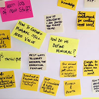
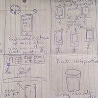
The next step was to begin generating as many ideas as possible to solve for the user. With the aid of the artifacts created during the research phase and the POV statements framing the problem I ran two timed 10 minute brainstorming sessions to see what I could come up with.

Sketches from one of the brainstorming sessions.
Having put a few ideas together in the brainstorming sessions I then looked at which we're the most practical and feasible and took those which I felt would work well and created a new storyboard detailing how these solutions might fit into the users day to day. These storyboards were then shown to two of the participants from the interview stage to again review and get their feedback on whether the new story made sense and seemed realistic to them and was iterated on until the solution seemed a good fit.
Future state storyboard.
Having now come up with some ideas that potential users felt were good and seemed beneficial the conclusion was that a web and mobile application catering to the various needs of office workers was the way forward. To further understand if the features I had proposed were valuable to the users I created a landing page for the purposes of testing to gather both qualitative and quantitative user feedback.
The qualitative data was captured using Peek User Testing to see users actually using the site and hear what they understood about the product and also using Usability Hub to gain further insight into a larger audiences thoughts on what was being offered. I also ran an advert on Facebook to see how many email signups the page would capture over a 5 day period (37 is the answer, not a runaway success but the advert didn't have much money behind it although its reach far outweighed the amount of signups I got).
Click here to view landing page
Video of a user testing the Bizzy landing page.

Based on the feedback the next steps will be to re-evaluate some of the features initially proposed and to focus on just two or tree, regarding the landing page it needs to be streamlined with more focus on the features the product will offer making it clear to users what they are signing up for to see if it can aid in garnering more interest.
My role: UX Researcher | Interaction Designer | UI Designer
Like many ideas this one stemmed from personal experience and from listening to others. I am a big music fan and also travel a lot and sometimes, especially when you are somewhere where you don’t understand the native language, it can be difficult to find out what’s going on around you during your trip. Currently there are a number of applications already available that provide people with event information in different ways, either via advance notification through email, if they follow the band on social media or they actively search their favourite artists tour dates to know when and where they are playing. There currently isn’t a solution that combines the best features of each to provide users with real time information on upcoming gigs based on their location no matter where they are in a clear, simple way.
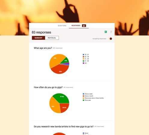
I knew from speaking to friends and colleagues that other people were having the same experiences but I needed to know if there was a large enough user group having the same problem to warrant further consideration. To validate my idea I first put together an online survey using Google forms which I sent out via social media, and online music forums to quickly gather as much quantitative data as possible from as many users as possible. Once I had assessed the results I then carried out five 1:1 user interviews to gain some qualitative insights into users behaviours and mindsets when it comes to listening to music, going to music events at home and abroad and buying tickets for those events.
Through the use of an online survey with over 80 respondents from a wide demographic I was able to define what the main target age group for this project would be based on their current behaiviours, browsing habits and how frequently they currently attend concerts/music events.The survey also provided a way to get some quick insight on user’s pain points.
After analysing the survey data I was able to find a number of respondents that seemed like they best fit the target user group and scheduled three 1:1 interviews to further probe them about their behaviours and experiences using current applications and organising and going to music events at home and abroad. Talking to these potential users showed me what current applications and platforms people were already using, the features in them that they find most important (and those that they found frustrating or felt were missing completely), how they use them and how they go about discovering new music and finding out about the concerts they attend.
Key findings:The main way people are currently finding out about music events is still through word of mouth (from friends), via social media (usually in advance notice), through a Ticketmaster search, signing up to Bandsintown or through traditional newspaper adverts.
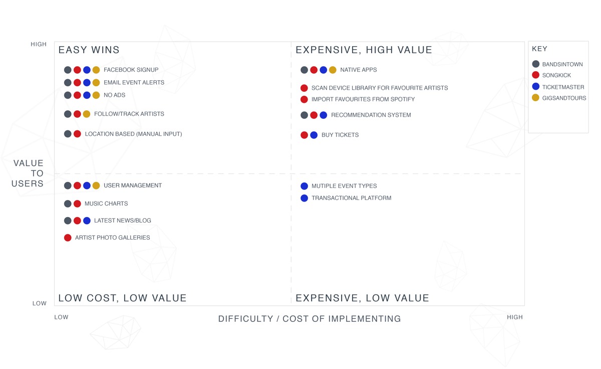
Following on from the user interviews and survey I compiled a list of the main events based mobile apps and websites that had been mentioned and some other competitors and like-minded solutions that I found out about and their individual features to see what features were wroth exploring or trying to improve on. It was noted that no single app really provided an experience tailored explicitly to each individual user.
Through the use of an online survey with over 80 respondents from a wide demographic I was able to define what the main target age group for this project would be based on their current behaiviours, browsing habits and how frequently they currently attend concerts/music events. The survey also provided a way to get some quick insight on user’s pain points.


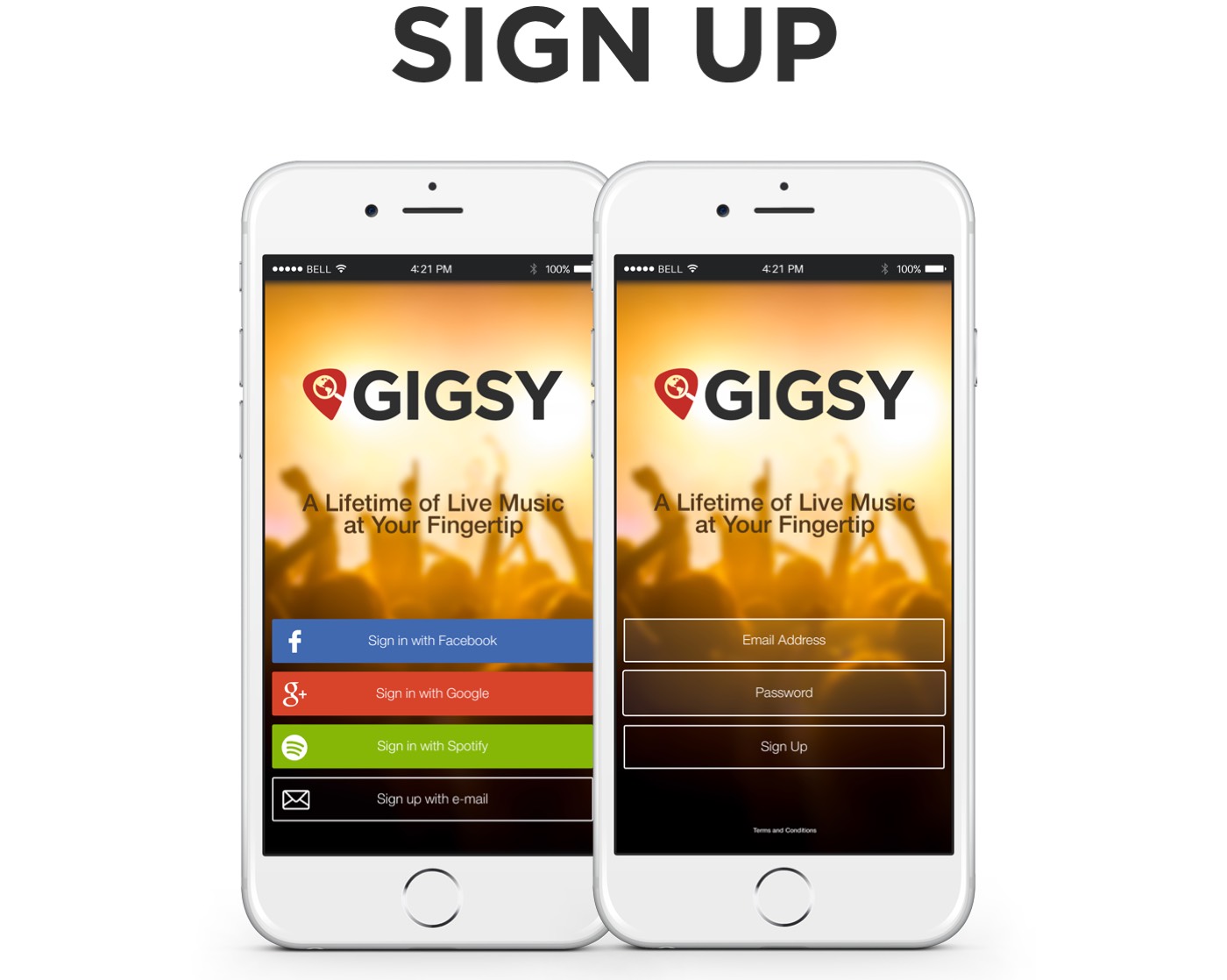
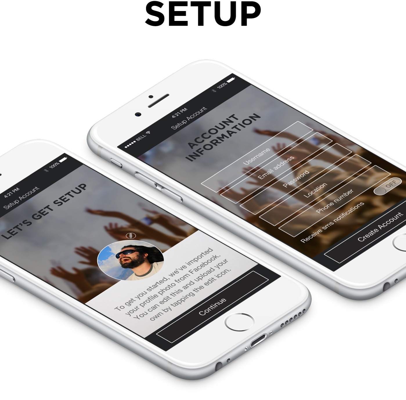
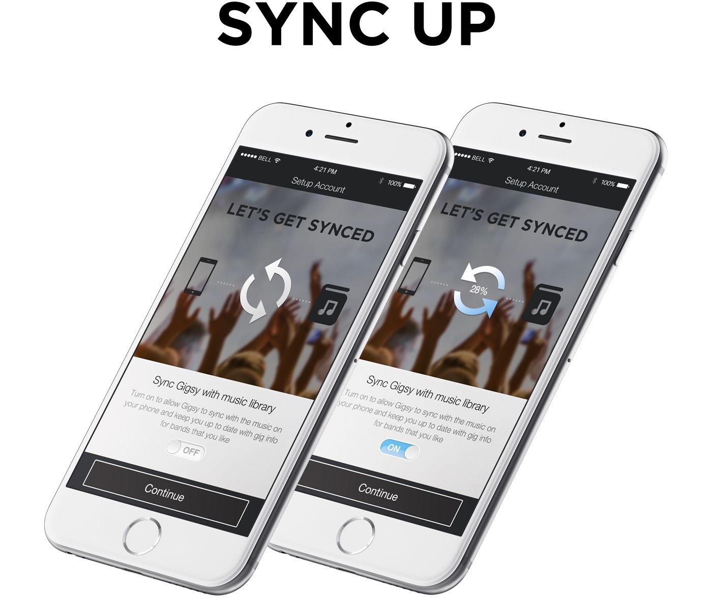
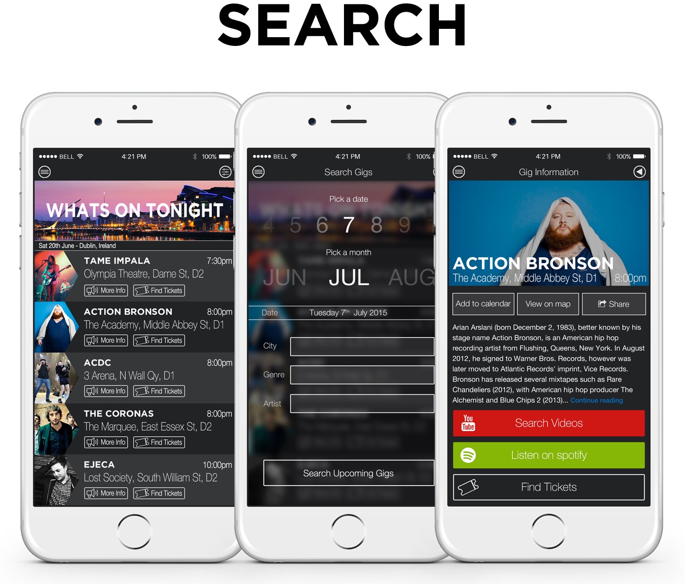
Based on all the information learned in the research stage as well as assessing the feature matrix to decide on the key features the Gigsy app would provide for users I mapped out the primary screens of the app from login to end goal (finding out about nearby music events and possibly purchasing gig tickets). It was important to make the user journey flow intuitively so it was a simple process from beginning to end.

I sketched out a number of different ways of laying out the information on the main screens of the event finder: the overall events list, an individual events details screen, and an event discovery screen. I iterated and further refined these sketches after determining all of the specific information and features that users would need on each screen.
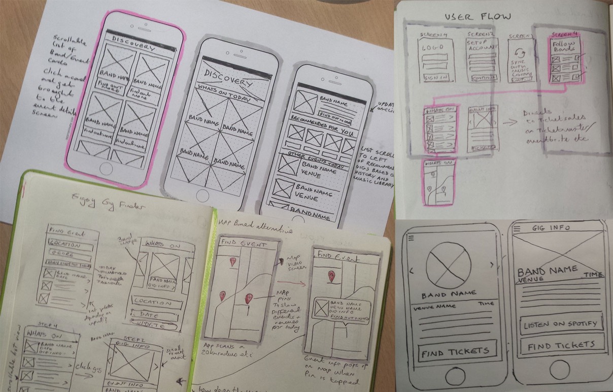
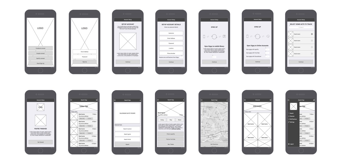
Once I had figured out the main user flow and screens for the app I created a number of sets of wireframes to give a better idea of how the information and functional elements would be laid out. These were then shown town to potential users to get feedback and then iterated on until I settled on a final set of wireframes which were later used as the basis for the visual design of the app.
My role: Web Designer | Information Architect | Front End Developer
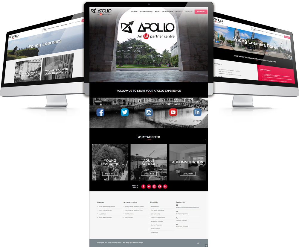
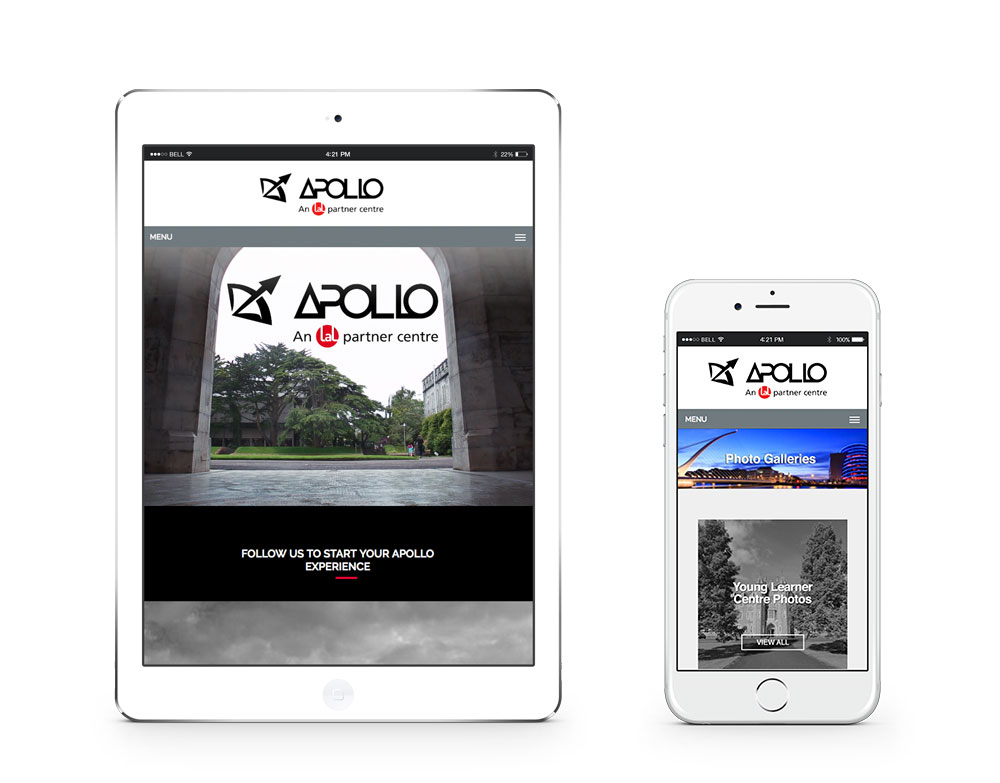
The guys over at Apollo approached me to design and build the site for their new business venture. Partnered with one of the global leaders in English learning the client had a clear vision of what they wanted from the site and an established set a brand guidelines to conform to.
The site needed to be structured in a way to make it as easy as possible for people, some of whom would have limited English to find the relevant information they needed on the courses available, accommodation for the duration of their stay, course fees and also the ability book places on each course.

Desktop wireframes used to agree structure with client.
The main challenges with this project were to do with time and ensuring the site conformed to the brand guidelines set out by the partners while also giving it its own unique look and feel.
There was a short amount of time from initial briefing until go live and a large body of information that needed to be gathered, created and organized in a way that made sense for potential visitors (people looking to learn English). I wanted to give the site a modern feel that was in line with current online trends at the time of build and representative of their own brand of school based here in Ireland.
A clean, simple to use website with multiple ways to navigate around the site. Careful consideration was taken with every elsement on the site, from the main homepage video highlighting some key landmarks around Dublin as soon as you land on the homepage to capture the audiences attention, as well as the imagery used of Dublin and Cork where the school's campus are located to show potential visitors a glimpse of the Irish culture before they arrive down to he font's chosen for legibility and sized to make sure they were clear to read for all users.
My role: UX Designer | Web Designer
Eason's schoolbooks website is a well established part of the overall Eason and Sons Ltd. online store that receives a large volume of traffic and handles thousands of transactions every year between primary, secondary and college level books and stationery supplies.
The site hadn't been updated in quite some time and the whole company had gone through a rebranding the previous year so with the new school season approaching they wanted to take a good look at how it could be improved while also having it reflect the new corporate look and feel. key area for improvement were the naviagtion and checkout could also be improved The idea was to use data and feedback to iterate through concepts, prototypes, and design decisions quickly to create a better overall user experience and in turn increase sales online.
Simplify the site’s transaction process by 10% and in turn reduce shopping cart abandonment and increase conversion rates. Improve the usability, user experience and create a more coherent on brand design. Improve on site searchability and navigation.
We established business objectives and customer goals based on a combination of stakeholder interviews, user testing, and web traffic log analysis to determine which pages were getting the most traffic and could be improved and where the drop-offs were happening.
A high level content card sorting was performed to organize the site’s massive inventory of books, study aids, stationary and accessories into better categorization.
Several rounds of gray scale wireframe prototypes and full color visual designs were created and tested prior to development.
Before Redesign
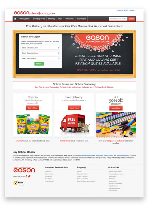
After Redesign.

We were succesful in reducing the average transaction process by the target of 10%, taking the journey from over 13 steps down to 9 from landing on-site to finish purchase. Usability testing of the prototypes showed that customers could complete 90% of their core tasks 50% faster than before. Additionally, the revised site architecture improved customers’ ability to find exactly what they were looking for by over 50%.
My role: UI Designer | UX Designer
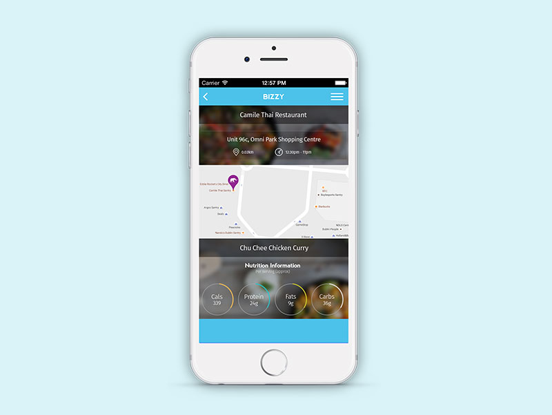
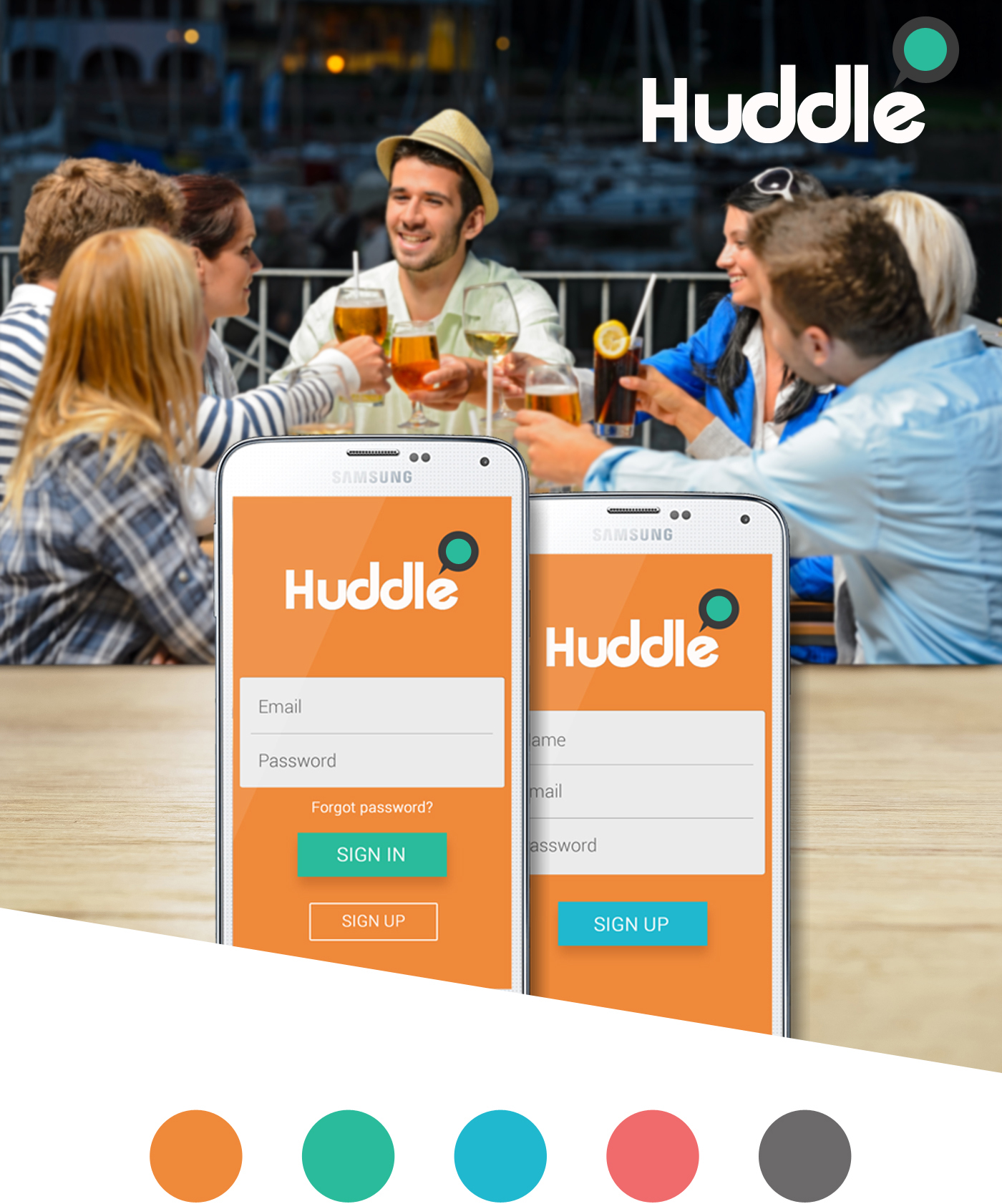
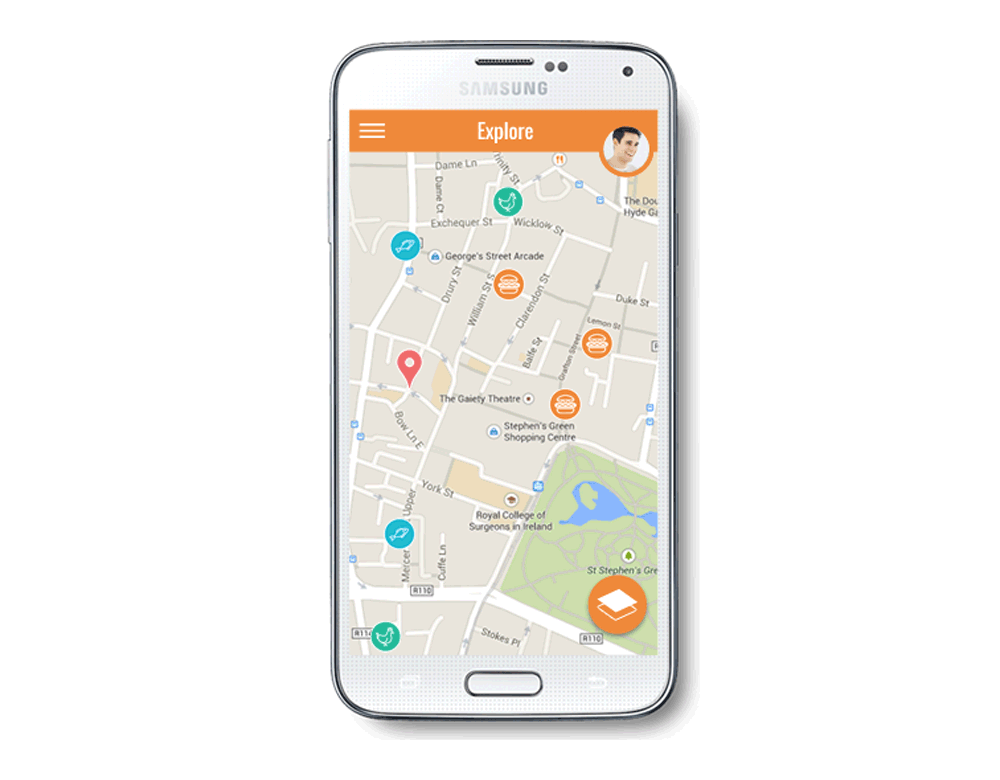
A concept mobile application designed for the purpose of providing users a fun and useful way to schedule meet ups. Whether it's a work lunch, a dinner date or even just some evening beers with good buddies Huddle is there to help you plan and keep track of all your outings.
The Huddle application allows you to search for bars, coffee shops and restaurants to plan a meet up at. Read user reviews on each venue, find out opening hours and distance from your location before you book a reservation. Huddle also helps you to keep track of all your arrangements so you never forget the plans you made with everything else going on in your life.


A clean, simple to use website with multiple ways to navigate around the site. Careful consideration was taken with every elsement on the site, from the main homepage video highlighting some key landmarks around Dublin as soon as you land on the homepage to capture the audiences attention, as well as the imagery used of Dublin and Cork where the school's campus are located to show potential visitors a glimpse of the Irish culture before they arrive down to he font's chosen for legibility and sized to make sure they were clear to read for all users.